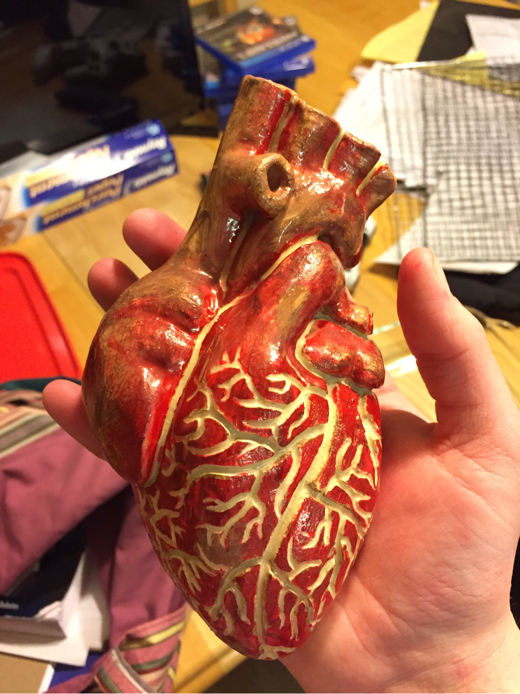
This is a hand made piece shaped as a heart, covered with red slip and the veins carved out white. One new skill I gained from this project was better carving skills and better understanding of when to carve clay. The art element is texture because most of the heart is smooth except for the veins. The design element would have to be proportion because the heart is the right size compared with the valves on it. I like this project because it actually looks like a real heart.
This is a multi pieced vase made on the wheel, it has an abstract carved design on its side and many colors dripping down, like purple, lavender, red, yellow, blue, and orange. One new skill I learned from making this project was how to attach multiple wheel thrown pieces to make one project. The art element of this piece is line and color, line because the lines and shapes carved throughout the project and color because of the variety of color used in the glaze of this vase. The design elements would be movement and rhythm, movement because the lines and shapes are moving in different directions, and rhythm because even thought there is a detailed pattern it isn't too busy and has a rhythm. I like this project because it is an attractive vase with a good glass and a fun pattern.
This project is a wheel thrown planter with a sand glaze and a blue green glaze in the moat of the piece. One new skill I gained from making this piece was being able to throw a double wall project. The main art element of this piece would have to be color, because of the way the sandy glaze melts together with the blue green and makes the blue green look like water. The design element of this project would be proportion because the proportion between the planter part of the project and the plate part were balanced and correct. I like this project because its light, and the colors really go well together.
This is a roundish short mug with a pulled handle, it has a black rim and a white glaze with tints of burnt orange and turquoise. A new skill I learned was how to better throw a small object on the wheel and foot it. The art element of this project is is the shape, it isn't a common one but it gives it a sense of hominess. The design element is contrast because of the dark black line and the light pale background. I really like this mug because of its style and its color, its probably one of my favorites.
These two plates are currently being used as plant platters, they are 6" wide with a 1" lip, glazed with shadow green, teal, brown, and orange. I learned that the glazes change day to day so if you want projects to look the same, glaze them on the same day. The art element of these projects are color, because the color is really deep and cool to look at. The design element is harmony because even though the glaze is detailed it still does not create a bust feeling. I really enjoy these two plates and the only thing I wish I did better was make them bigger.
This bowl has many color, it is a flatter bowl and is made out of vashon white clay, it has many holes in it throughout the piece. I learned that you shouldn't layer the glaze so thick that is falls while baking in the kiln. The art element of this piece is color because there are many different colors on the bowl. The design element is pattern because the holes are different sizes and they are spaces differently. I really actually did not like the results of this project, but everything is a learning experience.
This is an abstract piece that is half glazed with little white clay donuts that clash with the red clay body. The new skill I learned from this was haw to glaze in a new way. The art element would be texture because half the piece is glazed and it has different forms on it. The design element is contrast because the half glazed piece with little circles among the dark background. I like this piece because of the contrast and the color of the glaze.
|
AuthorWrite something about yourself. No need to be fancy, just an overview. ArchivesCategories |